Live Preview Edit Mode
Upgrade to Phoenix Code Pro to access this feature.
Edit Mode lets you modify your page directly in the Live Preview. You can edit text, rearrange elements, and update images and links. You can also duplicate, delete, and inspect elements with precise measurements.
Phoenix Code updates your source code automatically as you make changes.
Enabling Edit Mode
To switch to Edit Mode, click the mode selector dropdown in the Live Preview toolbar and select Edit Mode.
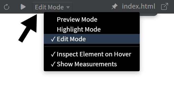
Alternatively, you can switch to Edit Mode by updating the livePreviewMode setting in the preferences file. See Editing Preferences to learn how to edit the preferences file.
Info Box
The Info Box displays information about an element.
By default, the Info Box appears when you hover over an element in the Live Preview, but this behavior can be changed. See the Inspect Element on Hover section for more details.
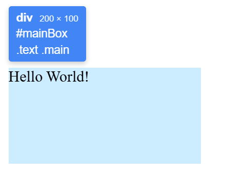
The Info Box displays:
- Tag name and dimensions: The element type (for example,
div,p,img) and its size in pixels (width × height) - ID: The element’s ID attribute (if present), shown with a
#prefix - CSS classes: The element’s classes, shown with a
.prefix. If the element has more than three classes, only the first three are shown, followed by a “+N more” indicator - Link URL: The element’s
hrefattribute (if present). This is shown only for anchor (<a>) elements
Visual Indicators
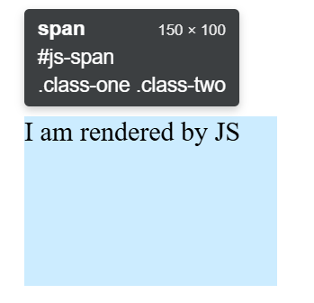
The Info Box normally has a blue background for standard HTML elements (for example, <div>, <p>, <img>). For dynamically created (JavaScript-rendered) elements, it appears with a gray background, indicating that these elements cannot be edited.
Tool Box
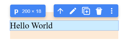
The Tool Box displays a set of tools you can use to modify elements in the Live Preview.
The Tool Box appears only when you click an element or select it through the source code.
Tool Box Options
The Tool Box displays different options depending on the selected element type. Some buttons are available for all elements, while others are specific to certain element types.
-
Select Parent (up-arrow icon): Selects the parent of the currently selected element.
This button appears only when a valid parent exists (it is not shown when the parent isbody,html, or a JavaScript-rendered element). -
Edit Text (pen icon): Opens inline text editing for the selected element. You can edit text directly in the Live Preview, and Phoenix Code automatically updates the source code.
This button appears only for elements that can contain text (it is not available for<img>,<video>,<br>, etc.).
See the Inline Text Editing section for more details. -
Edit Hyperlink (link icon): Opens a floating input box that lets you edit the element's
hrefattribute.
This button appears only for<a>elements.
See the Edit Hyperlink section for more details. -
Image Gallery (image icon): Opens an image gallery at the bottom of the Live Preview, where you can browse and select an image. You can also choose an image from your computer. Phoenix Code automatically saves the image to your project folder and updates the src attribute of the element.
This button appears only for<img>elements.
See Image Gallery for more details. -
Duplicate (copy icon): Copies the selected element and places it below. You can also duplicate elements using
Ctrl/Cmd + Dafter clicking an element.
This option is available for all elements. -
Delete (trash icon): Deletes the selected element. You can also delete elements using the
Deletekey after clicking an element.
This option is available for all elements. -
More Options (three-dots icon): Opens a menu with additional actions. You can also open this menu by right-clicking anywhere in the live preview, but only in Edit Mode.
This option is available for all elements.
See Cut, Copy, and Paste for more details.
The Tool Box is never shown for non-editable elements that are dynamically created by JavaScript.
Inspect Element on Hover
By default, in Edit Mode, hovering over elements in the Live Preview highlights them and displays the Info Box. You can change this behavior to show highlights only when you click elements instead.
To toggle this setting, click the mode selector dropdown in the Live Preview toolbar and unselect Inspect Element on Hover. By default, this option remains checked.
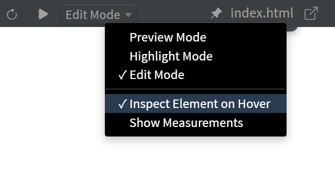
When Inspect Element on Hover is checked (default):
- Hovering over elements shows highlights and the Info Box
- Clicking an element selects it and displays the Tool Box along with the Info Box
When Inspect Element on Hover is unchecked:
- Hovering over elements has no effect
- Clicking an element shows highlights, the Info Box, and the Tool Box
Alternatively, you can change this setting by updating the livePreviewElementHighlights preference in the preferences file. Set it to "hover" (default) or "click".
See Editing Preferences to learn how to edit the preferences file.
Inline Text Editing
The Inline Text Editing feature lets you modify text content directly in the Live Preview, with all changes automatically synced to the source code.
To start editing, double-click an element in the Live Preview or click the Edit Text button (pen icon) in the Tool Box.
Edit the text as needed, then press Enter to save or Esc to cancel.
To insert a line break, press Shift + Enter.
Text editing is available only for elements that can contain text. It is not supported for elements such as
<img>,<video>,<br>, and similar non-text elements.
Text Formatting
You can apply formatting to selected text using standard keyboard shortcuts:
- Ctrl/Cmd + B: Bold; wraps selected text in
<b>tags - Ctrl/Cmd + I: Italic; wraps selected text in
<i>tags - Ctrl/Cmd + U: Underline; wraps selected text in
<u>tags
If the text is already formatted, the formatting will be removed.
Image Gallery
The Image Gallery lets you browse and select images from online image providers or your device and use them in your project directly.
Drag and Drop
The Drag and Drop feature lets you reposition elements in the Live Preview by dragging them to a new location. The source code is automatically updated with the new structure when you drop the element.
To drag an element: click and hold the element, then move your mouse to the desired location. The element becomes semi-transparent while dragging. As you hover over potential drop targets, Phoenix Code displays visual indicators showing where the element will be placed.
Visual Indicators
-
Arrow markers to indicate the drop position:
- Up (↑) or Down (↓) arrows: Places the element before or after the target element
- Left (←) or Right (→) arrows: Places the element before or after the target element (appears for flex row layouts)
- ⊕ symbol with a dashed border: Places the element inside the target as a child
-
Target label: A small box next to the marker displays the target element's tag name, ID, and classes
When multiple drop targets overlap (for example, an
imginside adivwith aligned edges), you can scroll slightly to cycle through targets and drop the element when the correct label appears.
Phoenix Code validates drops to prevent invalid HTML structure. For example, list items can only be placed inside list containers, and block elements cannot be placed inside inline elements. If a drop location is invalid, Phoenix Code shows the marker for the closest valid drop target. In some cases, when no valid drop target is found, Phoenix Code won't show any indicators.
To cancel a drag, press Esc.
When you drag an element near the top or bottom edge of the viewport, the Live Preview automatically scrolls in that direction.
Edit Hyperlink
The Edit Hyperlink feature lets you modify the URL and behavior of anchor (<a>) elements directly in the Live Preview.
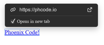
To edit a hyperlink, select an <a> element and click the Edit Hyperlink button (link icon) in the Tool Box. A floating input box appears near the element.
The input box includes:
- URL input: Edit the link's destination (
hrefattribute). PressEnterto save your changes orEscto cancel. - Opens in new tab: Check this option to make the link open in a new tab. Checking this option will add
target="_blank"in your source code. - Open this link: Clicking on this button opens the URL in your default browser. This option is available only in desktop apps.
Measurements
The Measurements feature displays ruler lines from the edges of a selected element to the document edges, showing exact pixel positions.
Cut, Copy, and Paste
You can cut, copy, and paste elements in Edit Mode using standard keyboard shortcuts or the Tool Box More Options menu (three-dots icon).
Using Keyboard Shortcuts
When you click an element in the Live Preview, keyboard focus moves to the Live Preview. You can then use:
- Ctrl/Cmd + X: Cut the selected element
- Ctrl/Cmd + C: Copy the selected element
- Ctrl/Cmd + V: Paste the copied or cut element below the currently selected element
Using the More Options Menu
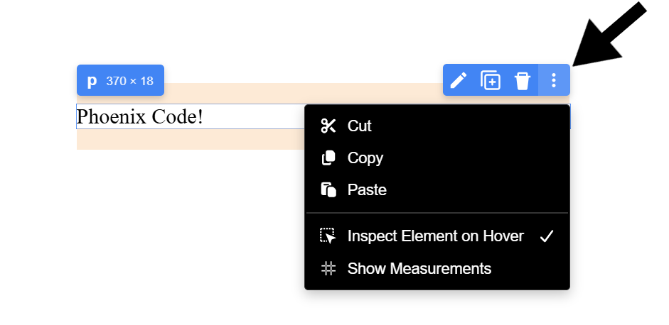
Click the More Options button (three-dots icon) in the Tool Box and select Cut, Copy, or Paste from the dropdown menu.
Keyboard shortcuts apply to elements only when focus is in the Live Preview. When editing source code, the shortcuts affect the code instead.
Undo and Redo
You can undo and redo changes made in Edit Mode using keyboard shortcuts:
- Ctrl/Cmd + Z: Undo the last change
- Ctrl/Cmd + Y or Ctrl/Cmd + Shift + Z: Redo the last undone change
These shortcuts work for all Edit Mode operations, including text edits, element moves, deletions, and other modifications.
Quick Preview Toggle
A Quick Preview Toggle button is available at the top center of the Live Preview. It lets you quickly switch to Preview Mode and back to the previously selected mode (Highlight Mode or Edit Mode). This is especially useful when working with a popped-out Live Preview window. You can also use the F8 keyboard shortcut to toggle Preview Mode.
The button is partially visible as a thin strip at the top edge of the Live Preview. Moving your cursor over this strip reveals the full button, which you can click to toggle Preview Mode.
Disabling Edit Mode for Specific Elements
If you have interactive elements (like navigation menus, modals, or carousels) that need to respond to clicks normally, you can exclude them from Edit Mode behavior.
Add the phcode-no-lp-edit class to any element you want to behave normally:
<div class="phcode-no-lp-edit">
    <!-- Clicks and interactions inside this element work normally -->
</div>
When an element has this class, the element behaves as if you're in Preview Mode.
This also applies to all child elements inside the marked element.
If you want only to exclude the particular element and not its children, use the class phcode-no-lp-edit-this.
Placing your cursor on the element in the source code will still select it in Live Preview and allow you to use edit features.